GolfPass Checkout Flow
UX/UI Design, architecture, and prototype
Project Overview
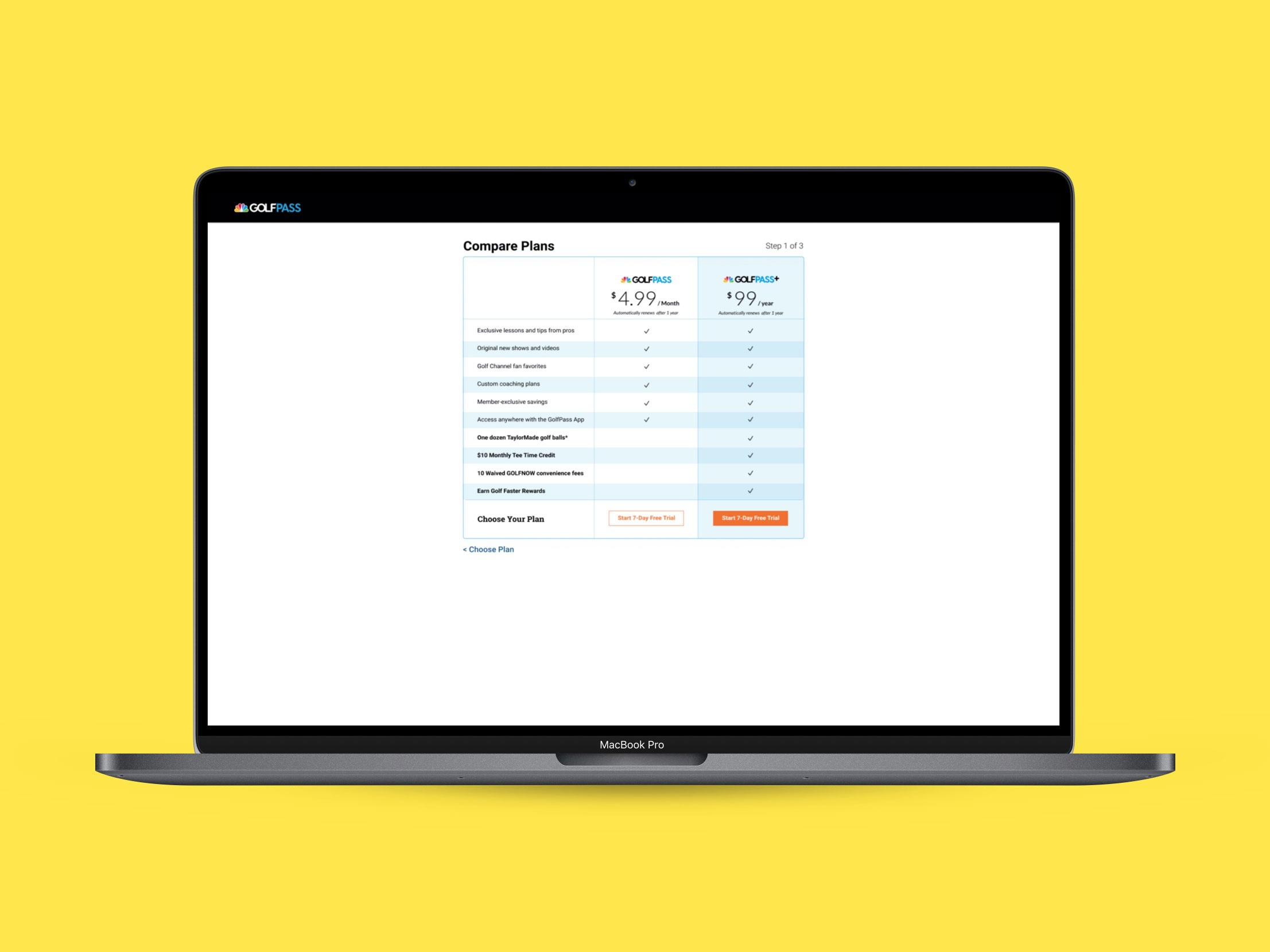
GolfPass is a subscription-based business and the business saw some users with frustrations with the initial approach. The initial approach was a one-page solution pick your plan and pay, all on the same page.
My Contributions
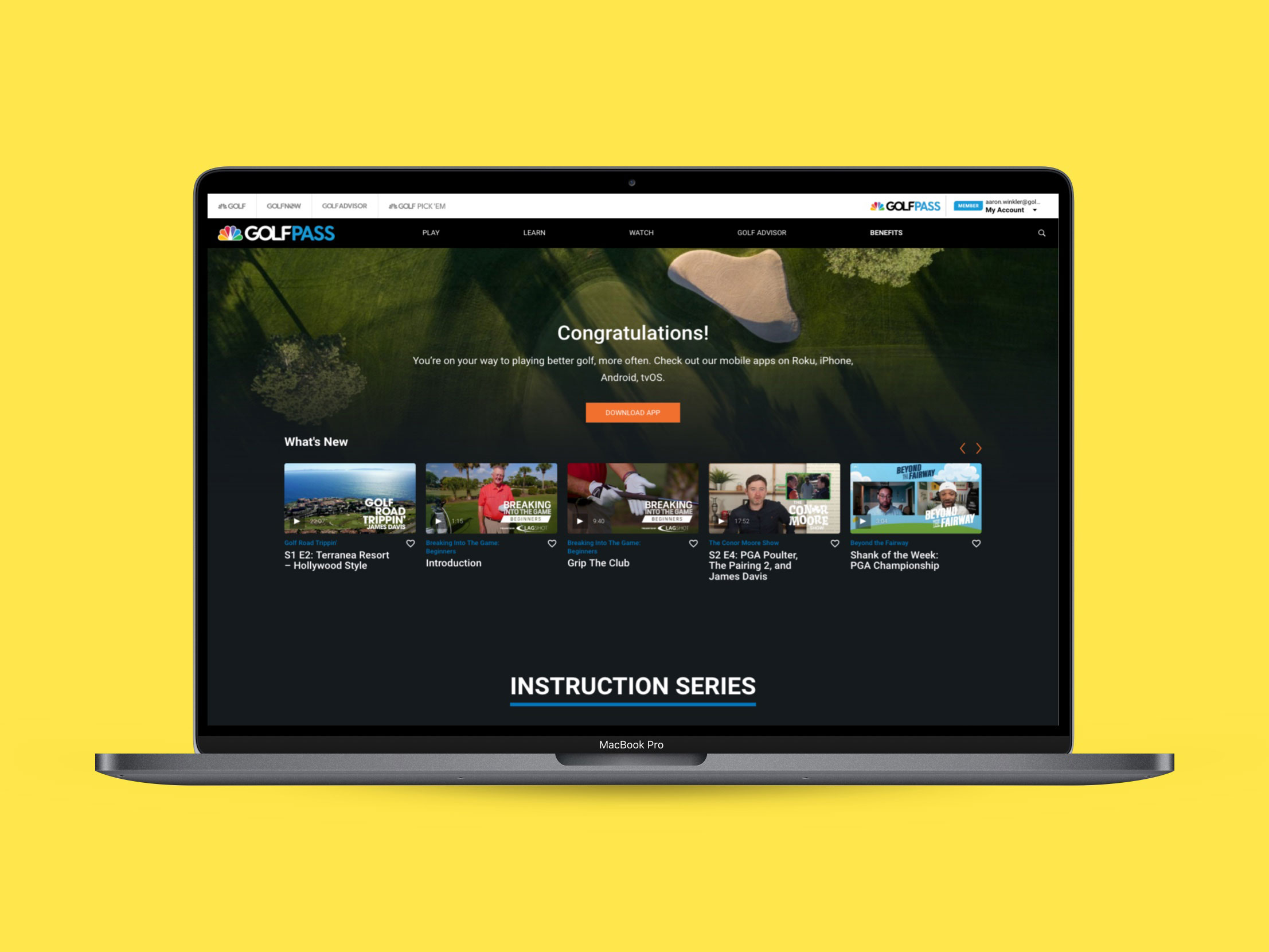
I created user journey, did research and design on this project. This has just recently gone live, but it has already gained traction with the first few weeks doubling subscriptions. I performed user research and testing that showed there could be gains made by seperating choosing a plan from the payment. I was also able to add some social proofing with a benefit-based quote and a compare plan view. Instead of one large page there are two pages, one for choosing a plan and the other for paying. Then once you pay you finish by creating your account.